Portfolio
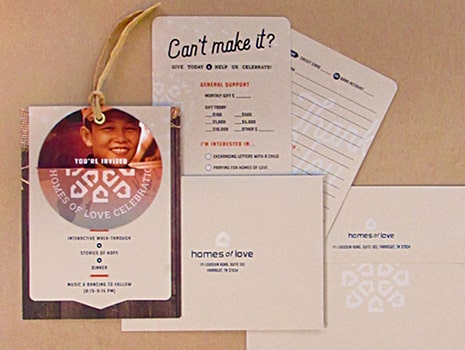
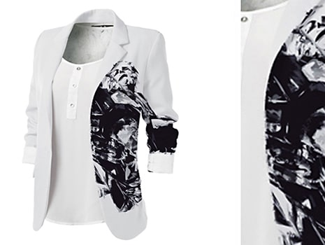
Homes of Love (HOL) creates families for orphaned, abandoned, and other at-risk children in Southeast Asia and Africa. They provide love and care by meeting a child’s basic needs, offering life direction, and equipping them for positive and productive living. We developed a complete creative brand overhaul that included a new logo and identity package, wearable designs, stationery, a strategic branding/marketing plan, research and development, a new tagline (“Creating Families for Life”), copywriting, positioning, fundraising/event planning, website and more.

The scope of Southern Walker Landscape Design’s project included the creation of a new name and logo, tagline “Life is a garden. Live in it.”, a stationery package, direct mail, research, website development, signage, and more. Our objective was to create a strong and creative position and image by promoting them as THE source for landscape design and installation services. The logo is representative of an iron garden gate, inviting, unique, and solid. The imagery and colors represent the sky and the designs found in nature.
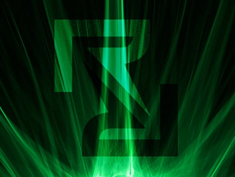
Radian’s software and hardware tracks the movement of high value assets, provides analytics about unsold inventory, and delivers accurate field inventory data daily. Our commission was to create and lay the groundwork for a new brand, one that represents Radian with a certain “cool factor.” A new logo, stationery package, PowerPoint presentation, and website splash page were created and implemented for this award-winning effort. Radian, a start-up company, continues to grow and find rewards from its initial brand investment.
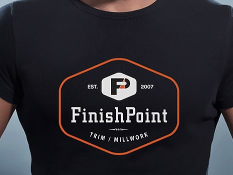
Our goal was to create a progressive corporate identity and branding package for this unique, high-end residential/ corporate construction trim & millworking firm. After developing and managing the creative naming process we then created a strong and retro/modern logo. All branding touch points-including stationery, trucks, swag, and exterior/interior building designs were planned to reflect the unique and top-of-the-line service Finish Point provides all their clientele.
We designed a responsive website using large photos of Hornsby’s work as a backdrop and showcase, simple yet elegant navigation, and a limited color palette based on the artist’s own designs. We also created a logo and stationery package as well.
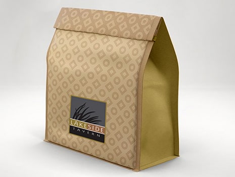
This upscale restaurant, located at a popular Knoxville marina, needed a logo, signage, menus, interior design consultation, promotional items, and uniforms. We used the local river oats as inspiration for the identity.

Emerald Youth Foundation commissioned us to design, develop, and produce this 8-page brochure as part of a campaign to communicate their two major initiatives they’re undertaking over the next decade to fulfill their mission. This unique brochure included a see-through cover with a special sandpaper-like clear varnish

Over the years, Willocks Brothers, has grown from a local and basic block manufacturing company into a more diversified national business by offering a wide variety of other manufacturer’s product lines. The scope of this project included the creation of a new logo, tagline, and logo/tagline lock-up. Our objective was to create a strong position and image by promoting them as a viable source for block, brick, and more. The linking “w” supporting a “block” is the graphic symbol that conveys its products and services.

Our commission for Arkis Biosciences was to lay the groundwork for a new brand by creating a new logo, stationery package, product collateral, photography, illustration, PowerPoint presentations, exhibits, and website development. The implementation of this award-winning effort uses the logo icon to represent an abstract “A” and a brain stem where the oval (“head”) meets the “A” positioned as a open canal running through it. The green and blue shapes below the “A” are symbolic of the life provided by Arkis technology. As part of its main goal, this growing VC firm continued to solicit and gain funding until it was sold in 2019.
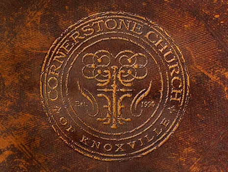
Cornerstone Church of Knoxville (CCK) is a church that uniquely embraces traditional Christian doctrine and values. When they contacted us, they were meeting in a school auditorium with construction plans underway for a new facility. They wanted a brand overhaul to coincide with the new construction as the current brand was generic, dated, and inconsistent with its brand message. We provided a complete spectrum of branding services, which included a new logo, collateral, website development, an online member survey, radio spots, and much more.